Yesterday's trip to London was pretty much centred around the 'Litchenstein: A Retrospective' exhibition, which was amazing, in fact I cant remember the last time I spent £14 and felt so pleased. Probably when I bought my blue trench coat from Debenhams last month- anyway I digress.
It was split into 13 different rooms-roughly in chronological order and showed the diversity of his work and varying themes.
Why Go? Aside from it being a rare chance to see a massive range of his work in one place, viewing the paintings in real life completely changes your perceptions of his techniques and the scale and diversity of materials- something which cannot be realised by seeing digital or print versions. Its seriously eye popping. Optical effects are used which cannot be achieved without attending! BOOK NOW because it gets stupid busy.
Highlight: 'Modern Sculpture 1967' - Because of the sepia toned mirror and the gorgeous curves. . l I just love the clash of art deco and late sixties golden glamour. Its the kind of thing I want recreated in my dream house! The piece could easily be modified into a dresser or side cabinet.
Downside: Mad busy- screaming kids and Europeans.
From Dots to Perfect Circles.
What I found most interesting was the development of the 'dot' Looking at the early pop stuff they are tiny (no more than half a centimetre on the canvas)-and this pretty much remains until the late 60's. The dots are by no means perfectly circular, yet its the general impression they give as a repeated pattern which is impressive. The brush strokes are not precise either, which kind of adds to the playful, fairytale narrative that runs throughout the war and romance comic book themed pieces.
When you reach the end of his work in the 90's the bold black lines are really neat and clear and so different to the loose strokes in the early sixties. The dot becomes more refined too and reach 1.5-2.cm in diameter.
.
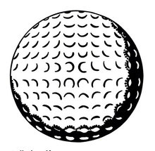
I love how playful and experimental he is with the dots and how he features them in so many different ways throughout his career as a painter. In Room 3- the black and white room he uses them to create texture,like in Golf Ball 1962.. In 'Desk Calender- 1962' just simply as background detail, and in Alka Selzer (1966) to signify movement of the bubbles. They are also used to create shadow, 3D contours, flashes and highlights of light, blocks of colour and graduated patterns.
It was split into 13 different rooms-roughly in chronological order and showed the diversity of his work and varying themes.
Why Go? Aside from it being a rare chance to see a massive range of his work in one place, viewing the paintings in real life completely changes your perceptions of his techniques and the scale and diversity of materials- something which cannot be realised by seeing digital or print versions. Its seriously eye popping. Optical effects are used which cannot be achieved without attending! BOOK NOW because it gets stupid busy.
Highlight: 'Modern Sculpture 1967' - Because of the sepia toned mirror and the gorgeous curves. . l I just love the clash of art deco and late sixties golden glamour. Its the kind of thing I want recreated in my dream house! The piece could easily be modified into a dresser or side cabinet.
Downside: Mad busy- screaming kids and Europeans.
From Dots to Perfect Circles.
What I found most interesting was the development of the 'dot' Looking at the early pop stuff they are tiny (no more than half a centimetre on the canvas)-and this pretty much remains until the late 60's. The dots are by no means perfectly circular, yet its the general impression they give as a repeated pattern which is impressive. The brush strokes are not precise either, which kind of adds to the playful, fairytale narrative that runs throughout the war and romance comic book themed pieces.
When you reach the end of his work in the 90's the bold black lines are really neat and clear and so different to the loose strokes in the early sixties. The dot becomes more refined too and reach 1.5-2.cm in diameter.
.
I love how playful and experimental he is with the dots and how he features them in so many different ways throughout his career as a painter. In Room 3- the black and white room he uses them to create texture,like in Golf Ball 1962.. In 'Desk Calender- 1962' just simply as background detail, and in Alka Selzer (1966) to signify movement of the bubbles. They are also used to create shadow, 3D contours, flashes and highlights of light, blocks of colour and graduated patterns.
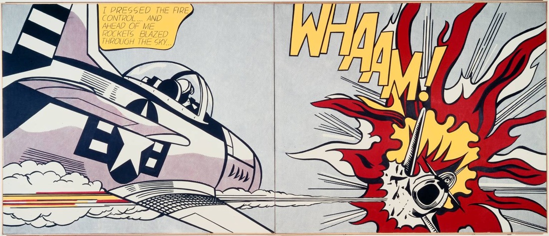
The classic primary colours are used so cleverly, with tiny dots of blue and red placed next to each other to create purple- only seen when you stand a metre or so away from the painting. This can be seen in 'We Rose Slowly-1964' (the orange hair of the man is actually dots of red and yellow) and 'Whaam! -1963', as well as others from the war time comic book strips.
I LOVE how the circles are put together to create little stars- like in 'M-Maybe 1965'. The detailing on the lip is so smart, as the colours are simply inverted to create a highlight of light. For me, the stars connote the American flag so m-maybe she's in New York ? (depicted by the skyline).
Anyway I could go on drawing on post modern analysis and the merging of high and low art etc but I think we all know the score with this dude, so go down immediately!
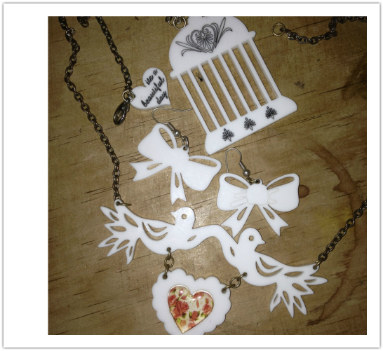
As I exited through the gift shop I couldn't help myself:
I LOVE how the circles are put together to create little stars- like in 'M-Maybe 1965'. The detailing on the lip is so smart, as the colours are simply inverted to create a highlight of light. For me, the stars connote the American flag so m-maybe she's in New York ? (depicted by the skyline).
Anyway I could go on drawing on post modern analysis and the merging of high and low art etc but I think we all know the score with this dude, so go down immediately!
As I exited through the gift shop I couldn't help myself:


 RSS Feed